
Phone, tablet and web
How HamQSO changes its layout on a phone, a tablet and a computer browser, and what only the app or only the web can do.
FreeUpdated for HamQSO 0.1.19
On this page
HamQSO is the same app on iPhone, iPad, Android and in a computer browser (the web, at app.hamqso.app). What changes is the layout: every page has one for phones, one for tablets and one for a computer window, and HamQSO picks it from the width of the window, not from the model of the device.
How HamQSO picks the layout
| Window width | What you see |
|---|---|
| Under 600 px (phone) | The DX, xOTA, Log, Alerts and Profile sections in the bar at the bottom. On DX and xOTA the Spot button floats over the list. |
| From 600 px | The sections move to a column on the left, with the logo at the top; Spot sits under the logo on DX, xOTA and Log. |
| From 840 px (tablet) | The tablet layouts: list and detail side by side, forms and settings centred and at most 720 px wide. |
| From 840 px in the browser | The web frame: side bar, top bar and radio bar (see below). |
| From 1200 px in the browser | The full desktop layouts: resizable panes, a side bar you can widen, solar indices in the top bar. |
The layout follows the window: rotate the tablet or narrow the browser window and the page changes layout at once. The app on an iPad never uses the computer layout. In the browser, under 840 px, HamQSO uses the phone layouts, like the app: the bar at the bottom, or the column of sections from 600 px.
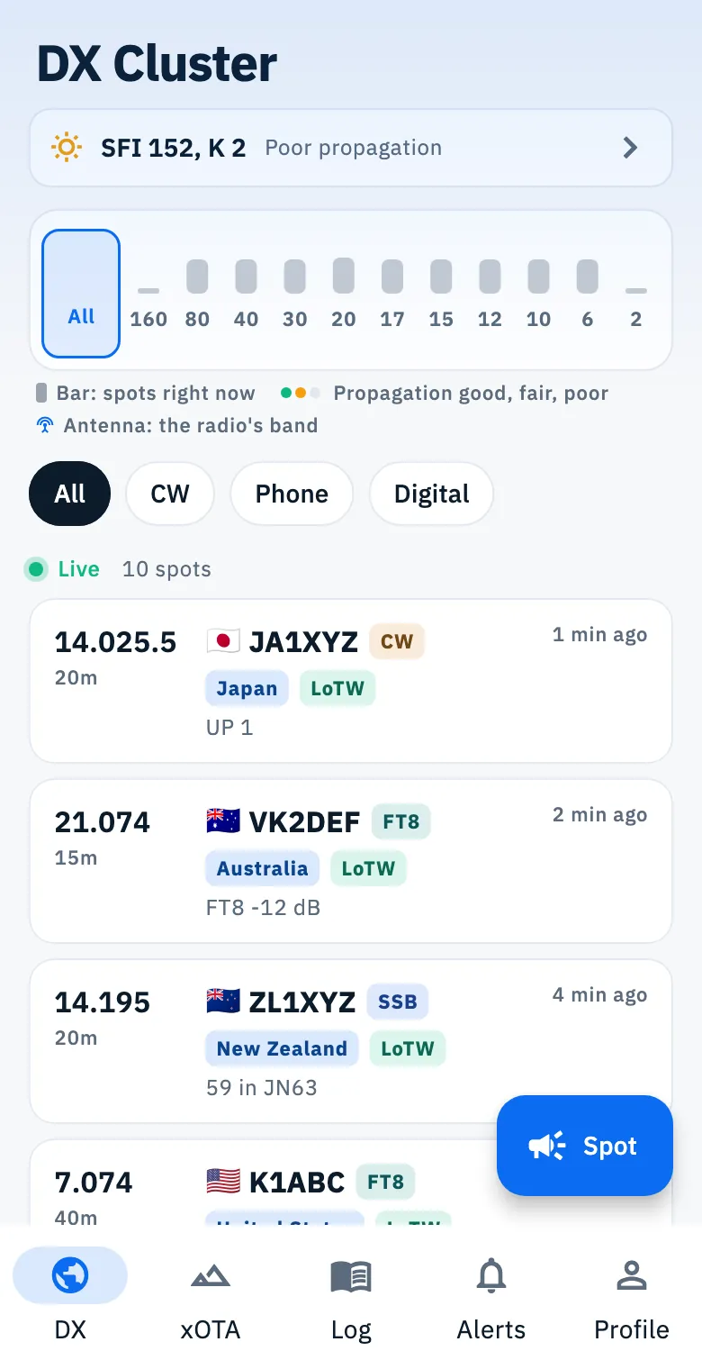
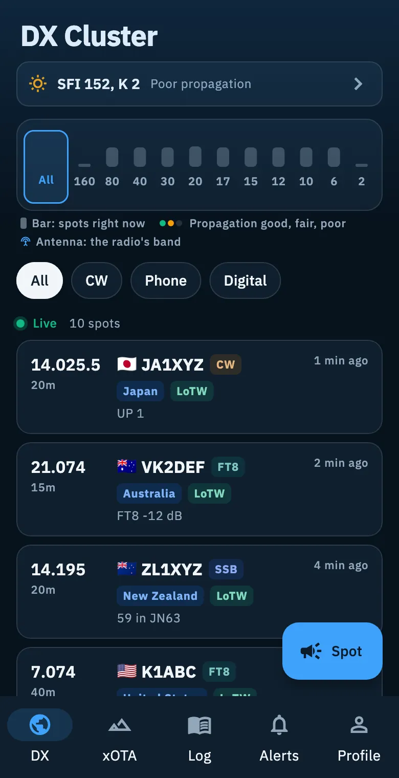
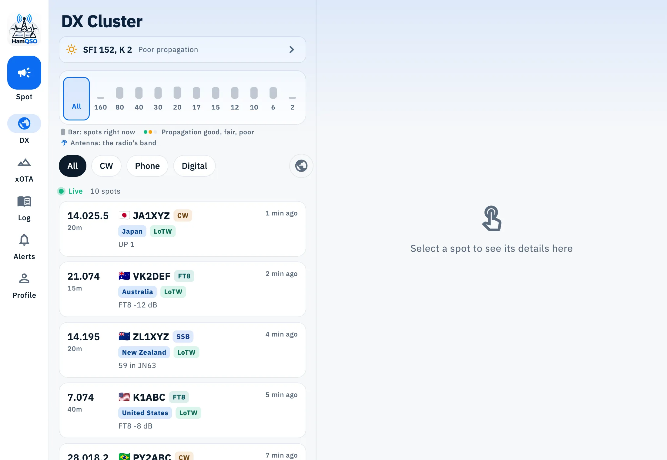
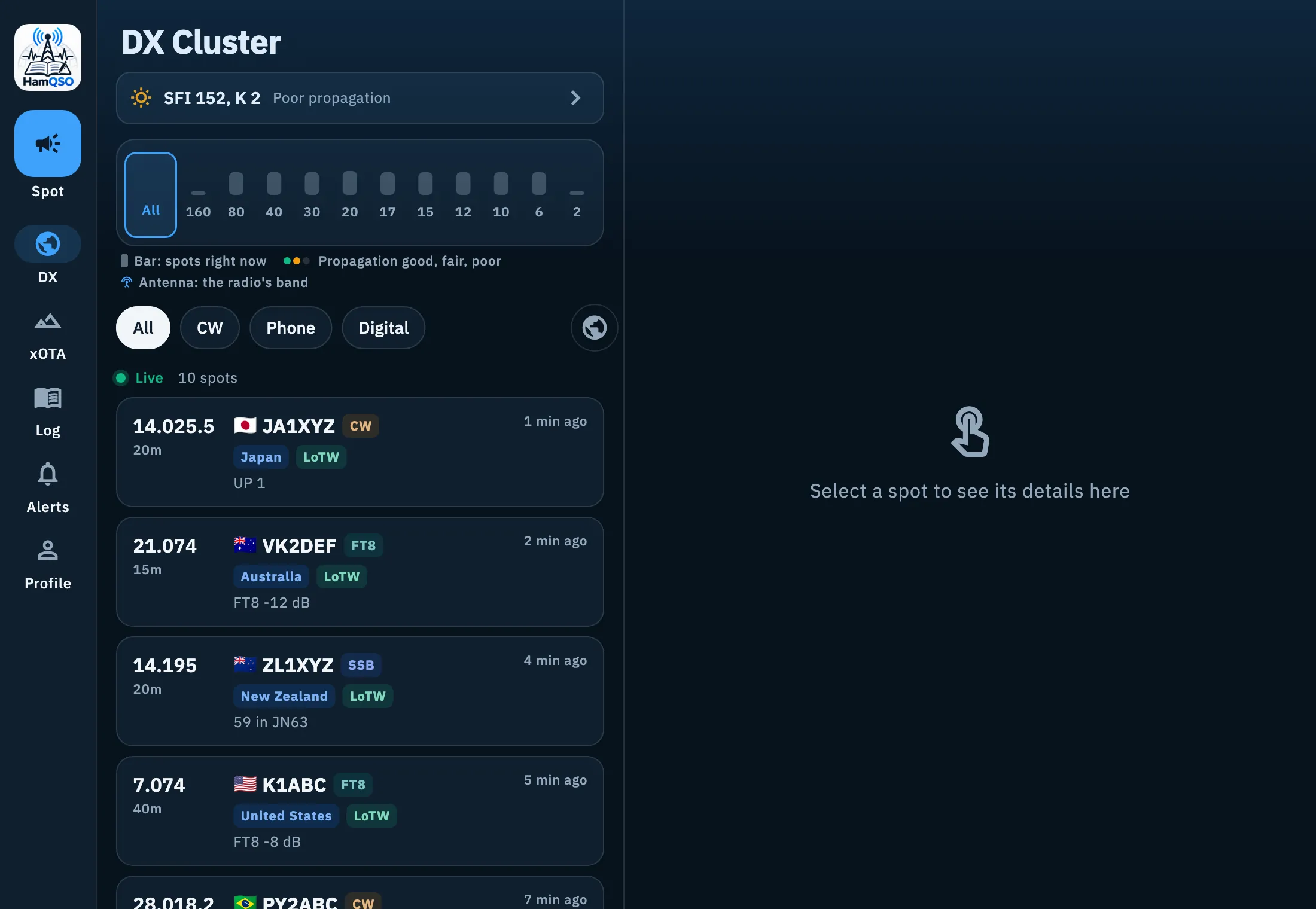
In a computer window the text is smaller and the rows are denser; in a window less than 700 px tall the spot rows get even shorter so more of them fit.
Screen orientation
- Phone (short side under 600 px): the app stays in portrait.
- Tablet: the app turns to every orientation, with its own layouts.
- The desk-mode Globe turns to landscape on a phone too; when you leave it, the normal rule comes back. See the desk-mode Globe.
- Web: the browser does not lock the orientation; the Globe fits the window.
The web frame
Open app.hamqso.app in your computer's browser, in a window at least 840 px wide. Around the pages there is a frame that stays put: only the content changes.
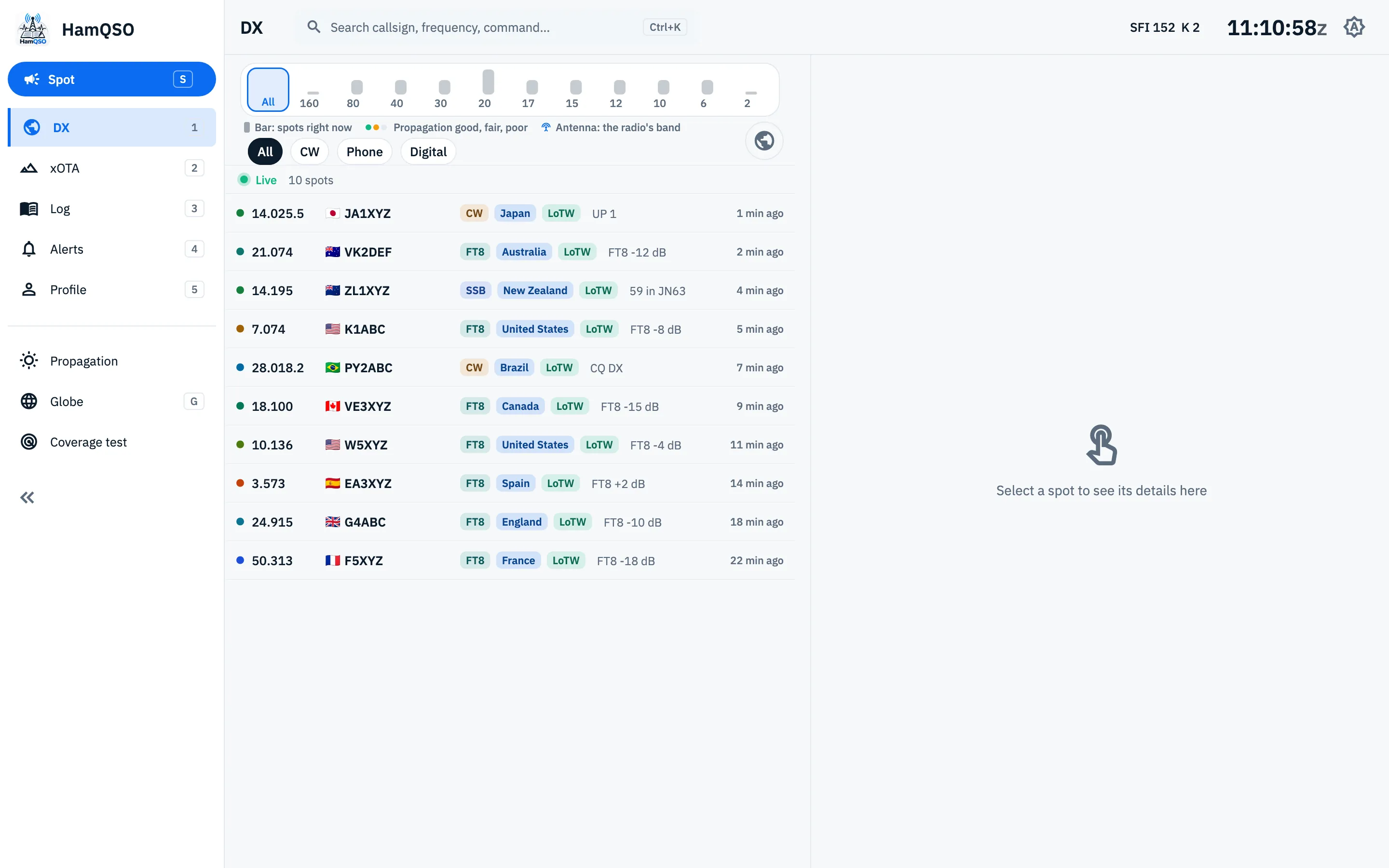
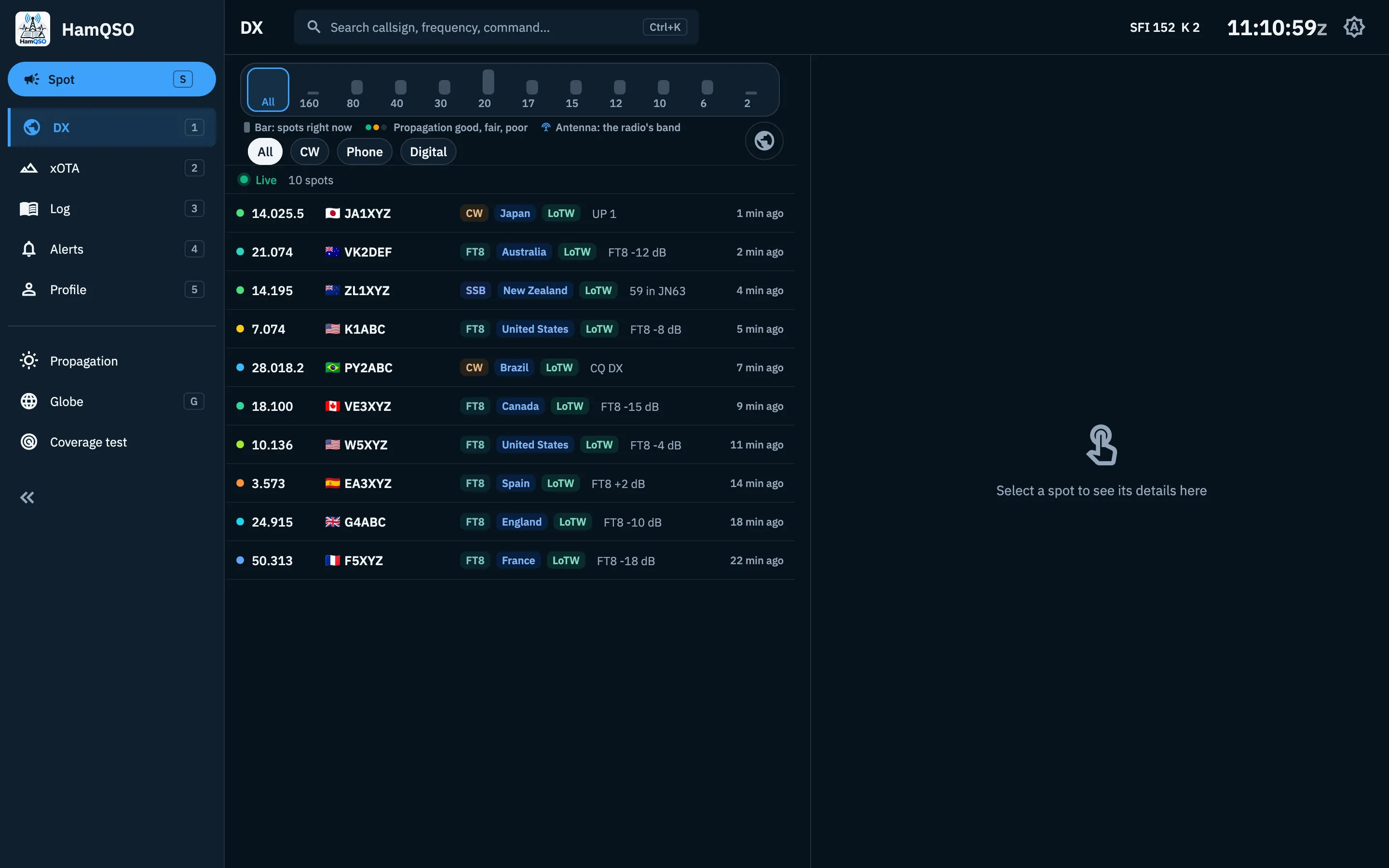
The side bar, on the left, from the top:
- The HamQSO logo.
- Spot, with the S key: spot a station from any section. See Spotting a station.
- The five sections DX, xOTA, Log, Alerts and Profile, with the keys 1 to 5. The open entry is coloured.
- The pages Propagation, Globe (key G), My station, Coverage test and eQSL HamQSO.
- At the bottom, the button that widens or narrows the bar.
Click an entry to open it. A page of the side bar is never opened twice: if it is already open, you go back to it. Settings is not in the side bar: open it from Profile, as on phone and tablet.
My station shows only when the browser can connect a radio over USB (Web Serial): it is not there in Safari and Firefox, for example. See Connection types.
The top bar, from the left:
- Where you are: the name of the section, or the path of the page (for example Profile › Settings ›). Click a step of the path to go back to it.
- The palette field, "Search callsign, frequency, command…": also opens with Ctrl+K (⌘+K on a Mac). See the command palette.
- The solar indices, for example "SFI 152 K 2": a click opens Propagation. They show once the data arrives; a missing value shows as "–". See Reading propagation.
- The UTC time, ticking every second (for example 14:32:05z).
- The theme button: each click goes from System to Light, to Dark and back to System; its tooltip says the current theme ("Theme: System"). It is the same choice as Settings › Theme.
The radio bar, at the foot of the page, shows the connected radio. See the radio panel.
Wide or narrow side bar
The side bar shows icons and names, or only icons to leave more room to the page.
- Click the button with the double arrows at the bottom of the bar ("Collapse the side bar"), or press Ctrl+\ (⌘+\ on a Mac). The shortcut works while you type in a field too.
- When it is narrow, hover over an icon: the tooltip gives the name and the key of the entry.
- Do it again to widen it ("Expand the side bar").
The choice is saved in that browser. The bar starts wide.
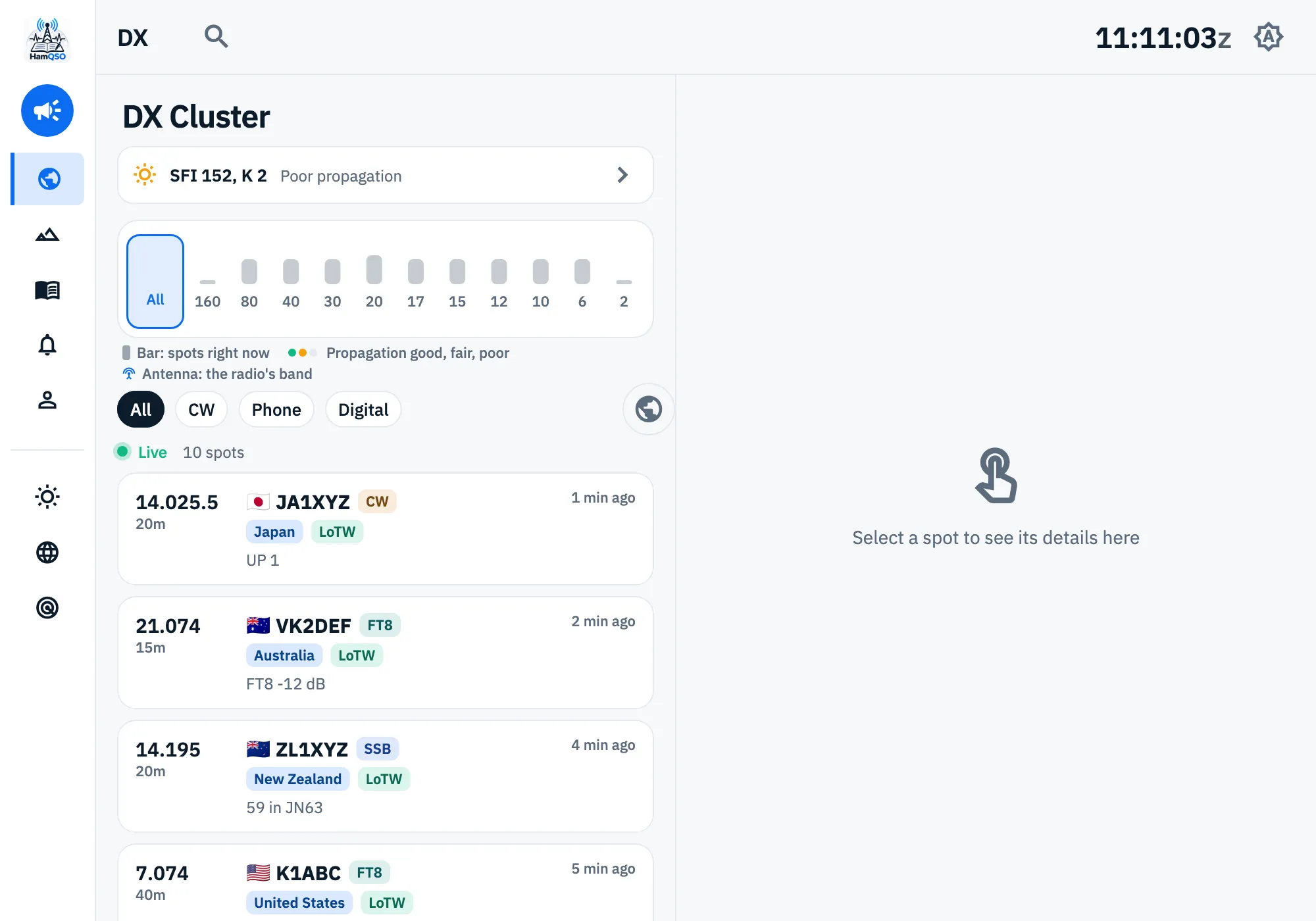
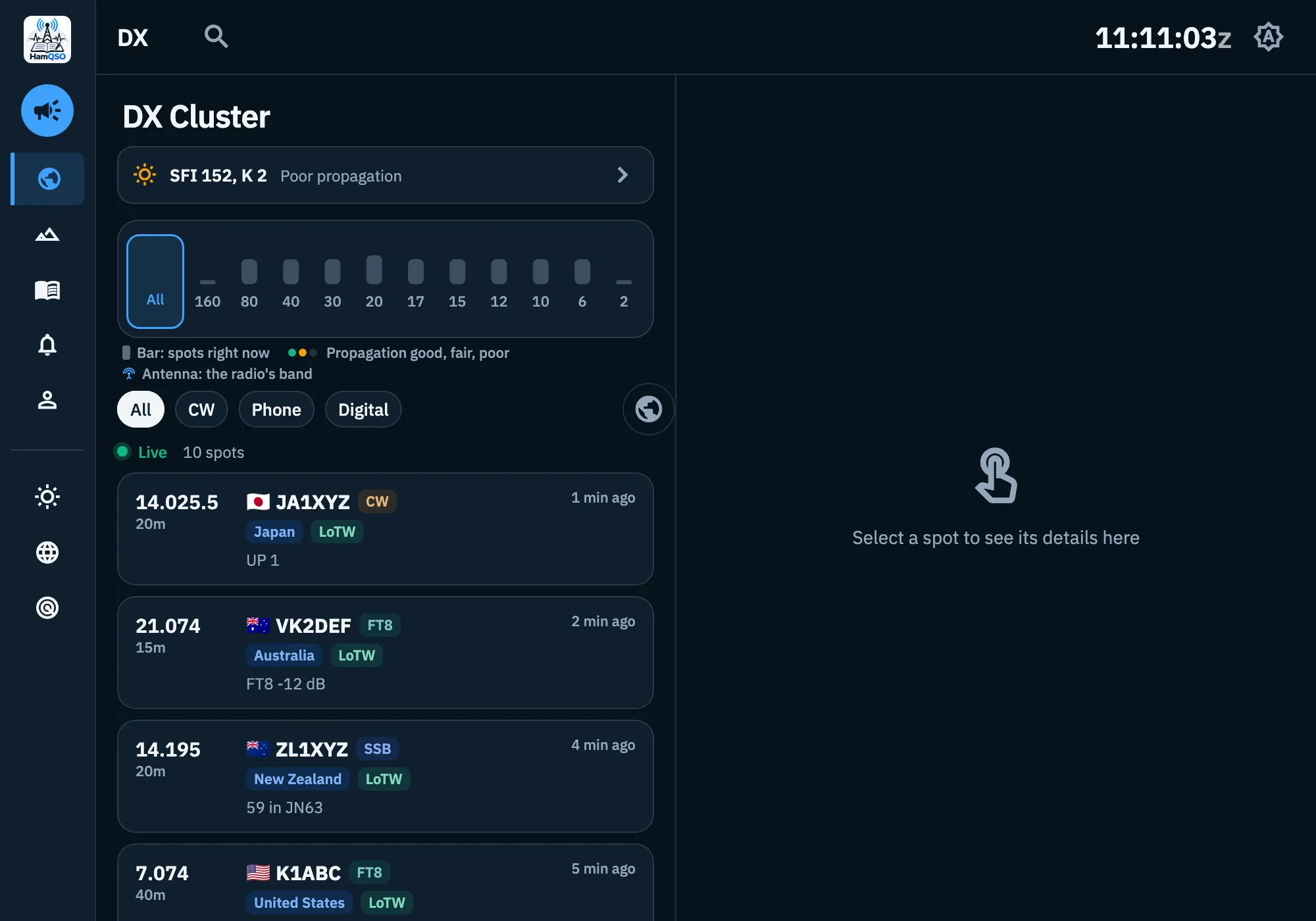
Windows between 840 and 1200 px
In a window narrower than 1200 px the frame stays, but more compact:
- the side bar is always narrow and the button to widen it is not there;
- the palette field becomes a magnifier icon;
- the solar indices are hidden;
- pages use the tablet layouts (or the phone ones, when less than 840 px are left beside the side bar).
Resizable panes
On pages with two panes side by side or one above the other (for example the spot list and its detail, the globe above the detail, the operations beside the log) you can give more room to one of them.
- Drag the separator between the panes.
- Double-click the separator to go back to the starting size.
- With the keyboard: focus the separator with Tab, then use ← → (side by side) or ↑ ↓ (one above the other) to move it by 16 px.
The size is saved in that browser, for each pair of panes, between a minimum and a maximum. On a tablet the panes have a fixed size.
Dropping an ADIF file
- Drag one or more
.adior.adiffiles onto the window: "Drop to import into the log" appears, with "ADIF files only (.adi, .adif)" under it. - Drop the files: the import opens with the files already loaded. See Importing an ADIF file.
Keyboard shortcuts
Keyboard shortcuts work only in the web frame. The main ones:
| Key | What it does |
|---|---|
| 1–5 | Opens a section |
| S | Spot |
| G | Opens the Globe |
| Space | Pauses or resumes the spot list (in DX and xOTA) |
| Ctrl+K | Opens the command palette |
| Ctrl+\ | Widens or narrows the side bar |
| ? | Shows the shortcuts of the page |
On a Mac use ⌘ instead of Ctrl. Single keys do nothing while you type in a field. The full list is in Keyboard shortcuts.
What differs between the app and the web
What the browser cannot do is not offered on the web: no button that does nothing.
| Feature | App (iPhone, iPad, Android) | Web |
|---|---|---|
| Direct (telnet) link to a DX Cluster node or the RBN | Yes | No |
| Network radio with rigctld or flrig | Yes | No |
| Radio over USB | Android only | In browsers with Web Serial |
| DX Replay video | Yes | In browsers that can make the video: it is downloaded, sometimes without music |
| Saving an image to the photo library | Yes | No |
| Sharing a file with another app (Instagram, WhatsApp…) | Yes | The file is downloaded; the DX Replay video can be shared where the browser allows it |
| Copying the live page image to the clipboard | No: it is shared | Where the browser allows it |
| Log sync | Also with the app closed, when the system allows it | Only while the page is open |
| Passwords of your services | In the system keychain | Encrypted (AES-GCM) in the site's storage |
| Orientation lock | Yes (phone) | No |
| Side bar, palette and keyboard shortcuts | No | Yes |
On the web, when a new version of HamQSO is ready, "New version available." appears with Reload and Later: QSOs not synced yet stay in the browser and sync by themselves.
In the list of devices the web is named after the browser and the system, for example "Chrome on Mac", or "Browser" when it is not recognised. See Your log on all your devices.
Everything on this page is free. The pages you open from the frame follow their own rules: Pro features show with the Pro badge and a tap or click opens the HamQSO Pro page.
Troubleshooting
- I do not see the side bar in the browser. The window is narrower than 840 px: widen it, or zoom the browser out.
- There is no button to widen the side bar, and the solar indices are missing. The window is narrower than 1200 px: widen it.
- The solar indices do not show. The propagation data has not arrived yet: they show by themselves.
- I cannot find "My station" in the side bar. The browser does not support the USB connection: use a browser with Web Serial, or the app on Android.
- "… is not an ADIF file (.adi or .adif)." You dropped a file with another extension: drop only
.adior.adiffiles. - "Could not open …" The browser could not read the file: drop it again.
- My phone does not turn to landscape. That is on purpose: on a phone HamQSO stays in portrait, except the full-screen Globe.